Case study
Renterra
Product storytelling for an equipment-rental software platform, across two generations of its website.
At a glance
$9M
Series A led by Avenue Growth Partners, January 2026
Source: Built In (opens in a new tab); RER Magazine

- Client
- Renterra
- Industry
- Rental software (SaaS)
- Services
- Graphic design, web design, development
- Website
- getrenterra.com
Before and after
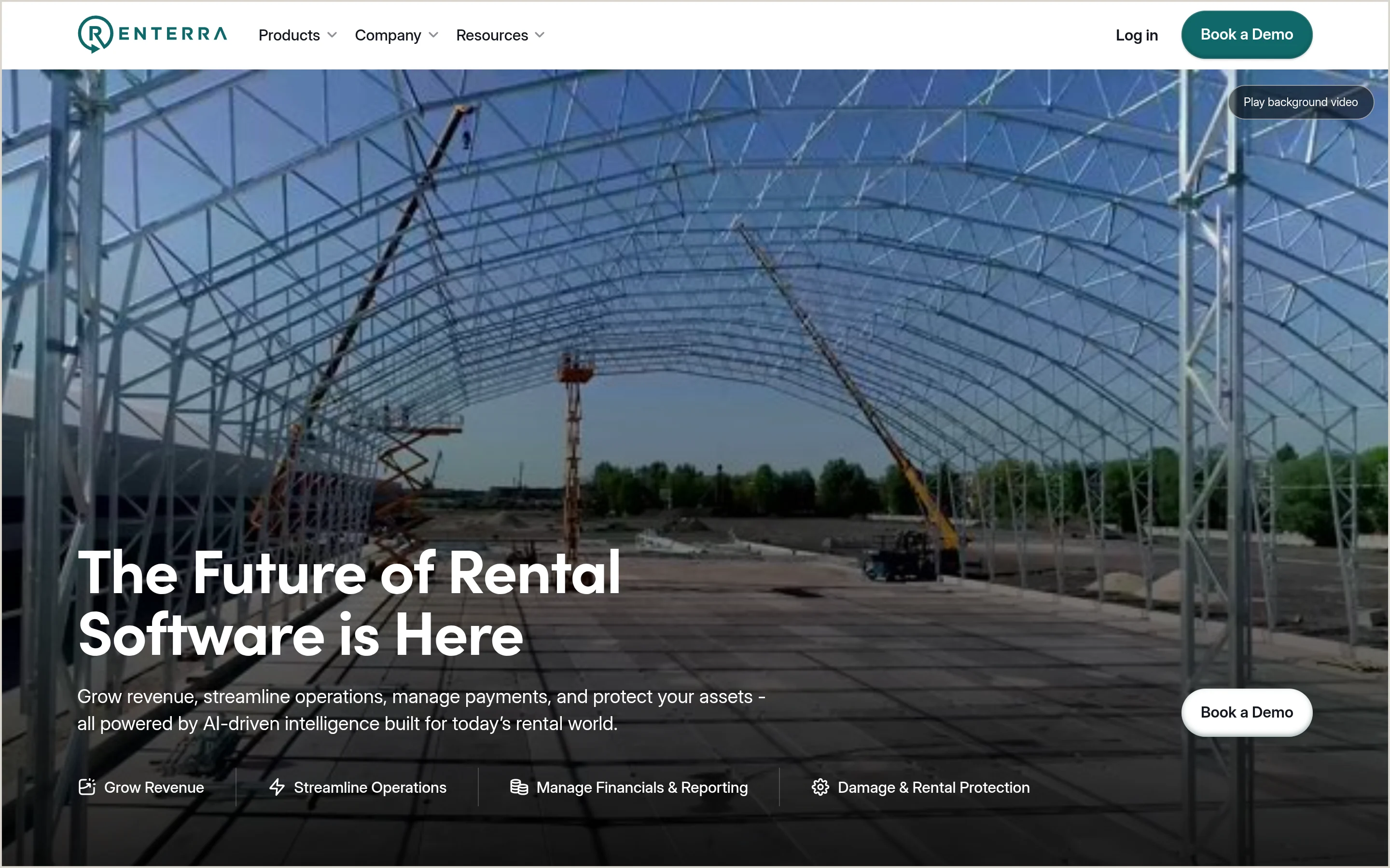
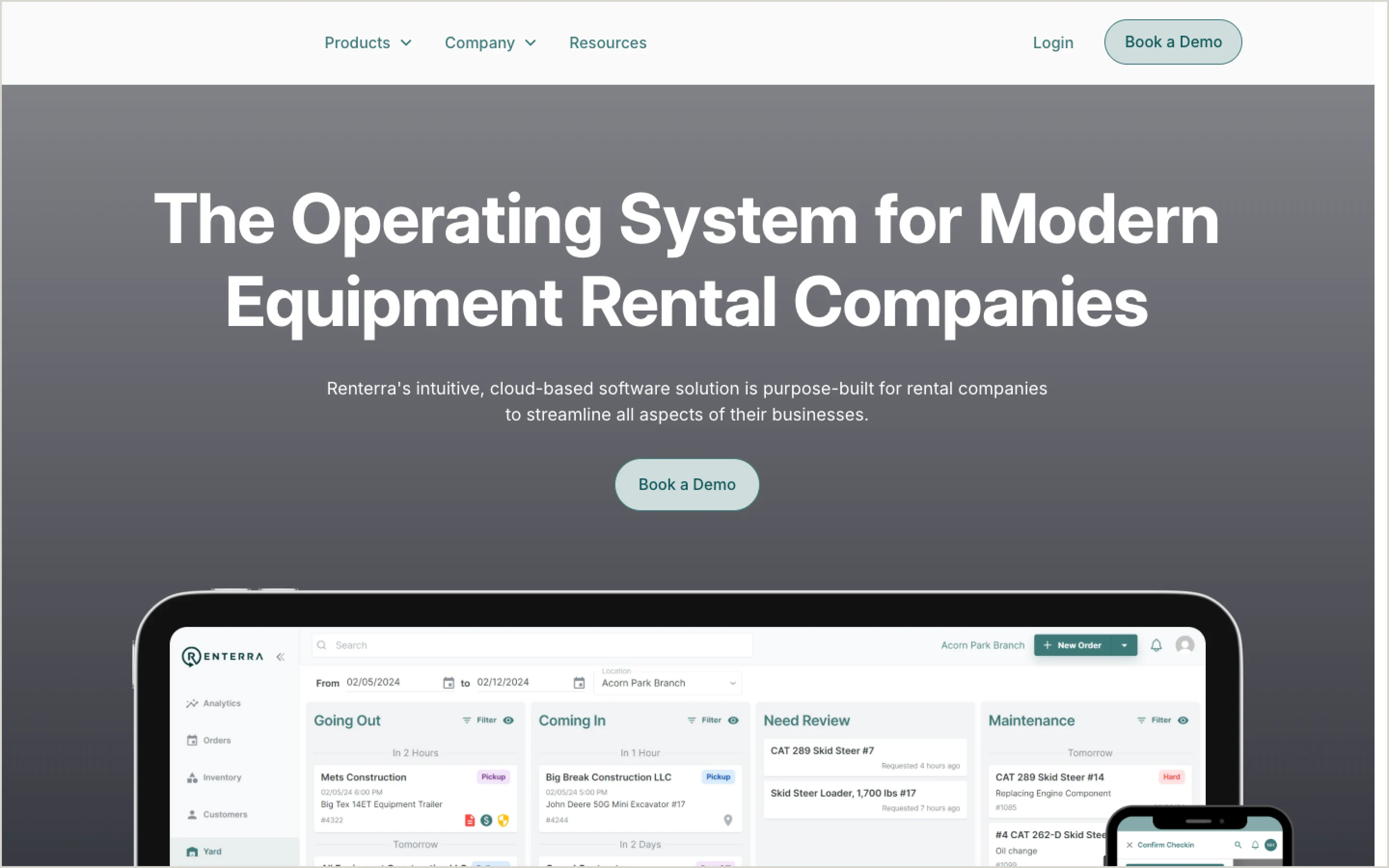
Use the left and right arrow keys, Home or End to move the divider between the before and after site.
The challenge
Renterra’s platform covers a lot of ground: yard management, online storefronts, payments, damage protection and reporting. Rental operators needed to understand all of it quickly, and dense product screenshots weren’t doing the job.
The site had to explain complex software simply and make booking a demo the obvious next step.
What we did
Strategy
Organized the site around the jobs a rental business does every day, with a product page for each capability and a demo request on every page.
Design
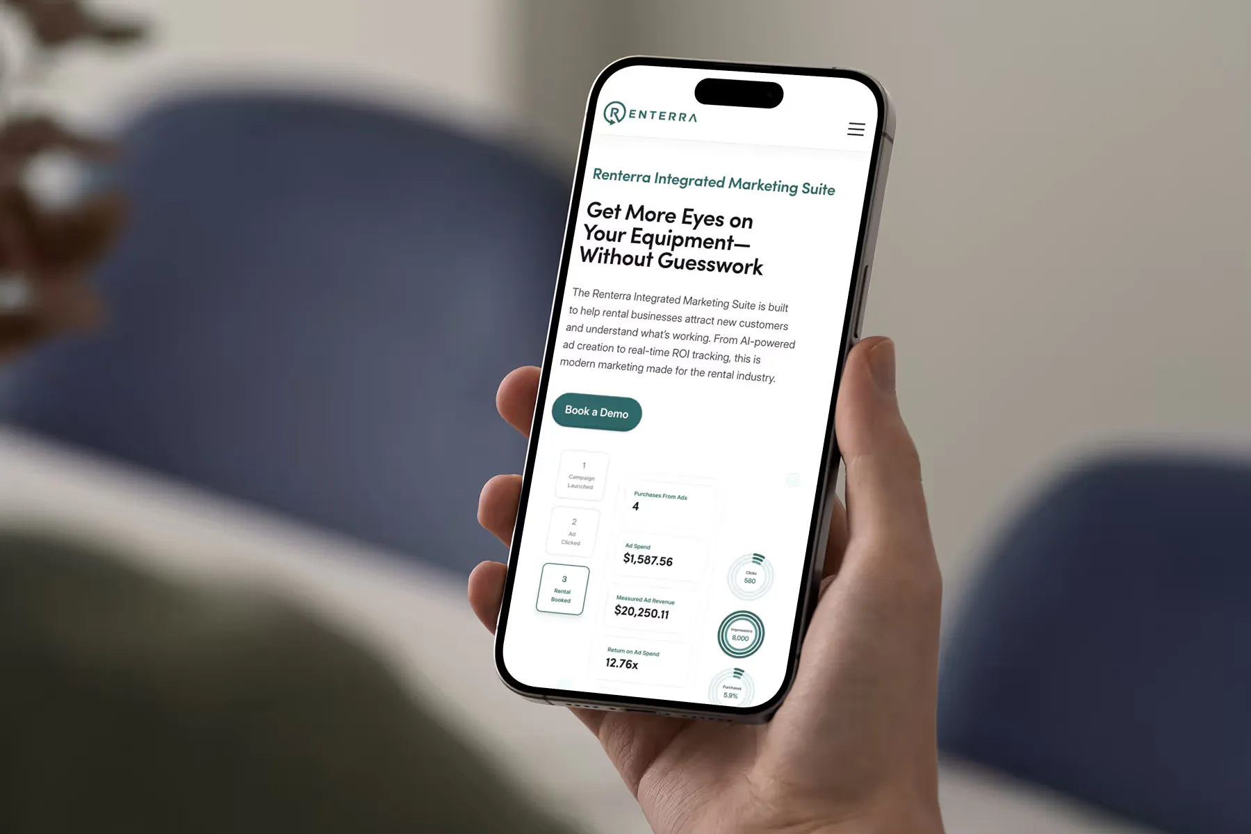
An extensive library of custom product graphics and interface illustrations that show how the software works without a wall of screenshots.
Build
A scalable Webflow build, redesigned in 2025, with technical SEO improvements so new product pages are easy to add and find.
Key features
01
Custom product graphics
Illustrated views of live yard management, integrated storefronts and financial reporting.
02
Page per capability
Each product area has its own page, so prospects land on the feature they searched for.
03
Demo-first navigation
“Book a Demo” is in the header and at the end of every page.
04
Technical SEO
Structure, metadata and performance work to support search visibility.




The results
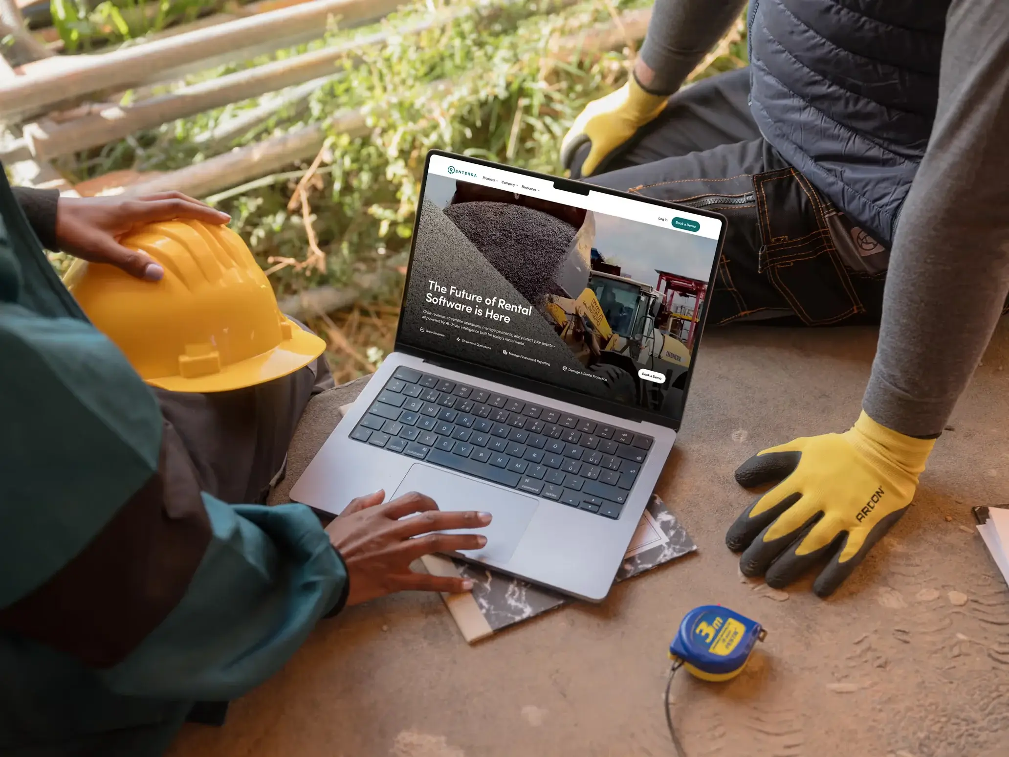
Renterra now has a clean, scalable site that explains a broad platform simply and grows with each new product line.
What happened next
Company milestones for context. We don't claim the website caused them.
Raised $3M led by Bienville Capital
Source: Built In Chicago
